
Exploratory Data Analysis and Statistics: Learning to Listen to Data Before Modeling
Learn how Exploratory Data Analysis helps you listen to data before modeling. This beginner-friendly guide explains mean, median, variance, distributions, correlation, scatter plots, heatmaps, and outliers using practical house pricing examples.
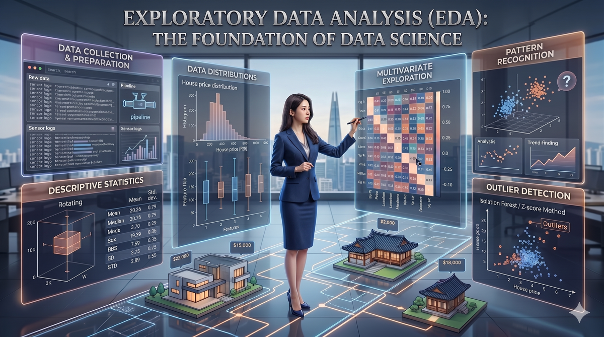
Before you train a model, tune hyperparameters, or build a dashboard, you need to do something more basic and more important:
Exploratory Data Analysis, usually called EDA, is the practice of examining a dataset before modeling so you can understand what is typical, what is unusual, what variables move together, and what problems might distort your conclusions.
A good data scientist does not jump straight into machine learning. A data scientist first asks:
- What does this dataset look like?
- What is normal here?
- What is strange?
- Which variables seem related?
- Are there missing values, outliers, or suspicious patterns?
- Could the data be misleading me?
EDA is where you build your first mental model of the data.
In this post, we will learn the core ideas behind EDA and descriptive statistics using a real-world example: house prices.
We will cover:
- Descriptive statistics: mean, median, variance, standard deviation
- Data distributions
- Outliers
- Correlation
- Scatter plots
- Heatmaps
- Practical EDA workflow in Python
- Common mistakes and anti-patterns
1 The Real World Why
Imagine you work for a real estate company.
Business problem: Why do we care about outliers in house pricing?
You want to build a model that predicts house prices. The dataset contains information like:
- House size in square feet
- Number of bedrooms
- Neighborhood
- Age of the house
- Distance to city center
- Sale price
At first, this sounds straightforward. Bigger houses probably cost more. Houses in expensive neighborhoods probably cost more. Older houses may cost less, unless they are historic or renovated. But then you inspect the data and see this:
| House | Size | Bedrooms | Price |
|---|---|---|---|
| A | 1,400 sqft | 3 | $350,000 |
| B | 1,600 sqft | 3 | $390,000 |
| C | 1,800 sqft | 4 | $450,000 |
| D | 1,500 sqft | 3 | $375,000 |
| E | 1,700 sqft | 3 | $410,000 |
| F | 1,550 sqft | 3 | $4,200,000 |
House F is unusual.
Maybe it is a mansion incorrectly recorded as 1,550 sqft. Maybe it is in a luxury neighborhood. Maybe the price has an extra zero. Maybe it includes a large amount of land. Maybe it is simply a valid luxury property.
If you ignore this outlier and train a model immediately, your model may learn a distorted relationship between size and price.
The trained model may think:
"Some average-sized houses cost millions, so I should predict higher prices for many similar houses."
That is dangerous. This is why EDA matters. EDA helps us avoid blindly trusting the dataset. It helps us ask better questions before we build models.
In business terms, EDA protects us from:
- Bad pricing decisions
- Misleading dashboards
- Broken forecasts
- Poor model performance
- Wrong strategic conclusions
- Expensive mistakes caused by bad data assumptions
EDA is the conversation you have with the data before asking it to make predictions.
2 Intuition: How to Think About EDA
EDA is like inspecting a used car before buying it. Imagine you want to buy a used car. You would not just look at the price and immediately pay.
You would inspect it first:
- How many miles does it have?
- Has it been in an accident?
- Does the engine sound normal?
- Are the tires worn out?
- Is the price suspiciously low?
- Is the seller hiding something?
EDA is the same idea, but for data. Before trusting a dataset, you inspect it.
You look for:
- Typical values
- Extreme values
- Strange patterns
- Missing values
- Relationships between variables
- Distributions
- Possible errors
A model is only as good as the data and assumptions behind it. EDA helps you check both. Descriptive statistics are your data's first summary.
Imagine you walk into a classroom of students and want to understand their test scores. You could read every single score one by one, but that would take time.
Instead, you might ask:
- What is the average score?
- What is the middle score?
- What is the highest score?
- What is the lowest score?
- Are most students close together, or are scores spread out?
These are descriptive statistics.
They help you summarize a dataset without looking at every single row.
3 Core Concepts
You'll learn about 4 core concepts:
- Mean: balance point
- Median: middle value
- Variance: how spread out data is
- Standard deviation: spread in original unit
3.1 Mean: The balance point
The mean is what most people call the average.
If house prices are:
300,000
350,000
400,000
450,000
500,000
The mean is:
(300,000 + 350,000 + 400,000 + 450,000 + 500,000) / 5 = 400,000
So the average house price is $400,000.
If every data point has weight, the mean is the point where the seesaw balances.
Formula
For values:
x1, x2, x3, ..., xn
The mean is:
mean = sum of all values / number of values
mean = (x1 + x2 + ... + xn) / n
The mean is useful when:
- The data is roughly balanced
- There are no extreme outliers
- You want a general central value
- The variable is numerical
When the mean can mislead you:
The mean is sensitive to outliers. It gets pulled upward immediately by one extreme value.
3.2 Median: The middle value
The median is the middle value after sorting the data.
Example:
300,000
350,000
400,000
450,000
4,200,000
The middle value is: 400,000
So the median is $400,000.
If the mean is the balance point, the median is the person standing in the middle of a line.
Imagine everyone lines up from cheapest house to most expensive house. The median is the house exactly in the middle.
Why the median is useful:
- The median is more resistant to outliers.
In our example:
Mean = 1,140,000
Median = 400,000
Which one better describes a typical house?
Answer: "The median"
Use the median when:
- Your data has extreme values
- Your distribution is skewed
- You want a robust idea of typical
- You are working with income, prices, wealth, rent, or other variables with long tails
3.3 Variance: How spread out the data is
Mean and median tell us where the center is. But they do not tell us how spread out the data is.
Consider 2 neighborhoods:
Neighborhood A:
390,000
395,000
400,000
405,000
410,000
Neighborhood B:
200,000
300,000
400,000
500,000
600,000
Both have the same mean:
400,000
But they feel very different. Neighborhood A has stable prices. Neighborhood B has much more variation.
This is where variance helps.
Variance measures how much values wander away from the average.
Low variance means → values stay close to the mean.
High variance means → values are spread far away from the mean.
Simple explanation:
- To calculate variance, ask:
- How far is each value from the mean?
- Square those differences so negative and positive differences do not cancel out.
- Average those squared differences.
Why square the differences?
Answer: "If we did not square the differences, values below the mean and above the mean would cancel each other."
Example:
10 + 10 = 0
That would incorrectly suggest no spread.
Squaring fixes this:
(-10)^2 + 10^2 = 100 + 100 = 200
Formula:
- Population variance:
variance = sum((x - mean)^2) / n
- Sample variance:
variance = sum((x - mean)^2) / (n - 1)
3.4 Standard deviation: Spread in the original unit
Variance is useful, but it has one problem. If house prices are measured in dollars, variance is measured in squared dollars. That is hard to interpret. Standard deviation solves this by taking the square root of variance.
standard deviation = sqrt(variance)
If the standard deviation of house prices is $50,000, that is easier to understand than saying the variance is 2,500,000,000.
Standard deviation tells you the typical distance from the mean.
A small standard deviation means → values are packed closely together.
A large standard deviation means → values are spread out.
4 Data Distributions: The Shape of the Story
A distribution shows how values are arranged.
Instead of only asking: What is the average? we ask: We ask: What does the full shape look like?
For house prices, a distribution can tell us:
- Are most houses affordable?
- Are there a few extremely expensive houses?
- Are there two separate markets, such as apartments and luxury homes?
- Are prices roughly symmetric or heavily skewed?
Common distribution shapes are:
- Normal distribution
- Right-skewed distribution
- Left-skewed distribution
- Bimodal distribution
Normal distribution
A normal distribution looks like a bell curve. Most values are near the center, and fewer values appear at the extremes. Many natural measurements roughly follow this shape, such as height.
Right-skewed distribution
A right-skewed distribution has a long tail on the right. House prices and income often look like this. Most values are moderate, but a few are extremely high. The mean is usually higher than the median because extreme high values pull the mean upward.
Left-skewed distribution
A left-skewed distribution has a long tail on the left.
Example: test scores on an easy exam where most students score high but a few score low.
Bimodal distribution
A bimodal distribution has two peaks. This may indicate two different groups mixed together.
For example:
- Small apartments and large houses
- New customers and loyal customers
- Economy cars and luxury cars
5 Correlation: Do Variables Move Together?
Correlation measures how two numerical variables move together.
For example:
- Does house size increase with price?
- Does distance from city center decrease price?
- Does number of bedrooms relate to price?
- Does advertising spend relate to sales?
The most common correlation measure is Pearson correlation. It ranges from:
1 to +1
Positive correlation
If one variable increases and the other also tends to increase, correlation is positive.
Example: larger house size means higher price
A correlation near +1 means a strong positive linear relationship.
Negative correlation
If one variable increases and the other tends to decrease, correlation is negative.
Example: greater distance from city center means lower price
A correlation near -1 means a strong negative linear relationship.
No linear correlation
If there is no clear straight-line relationship, correlation is close to '0' (zero).
correlation close to '0' does not always mean no relationship. It may mean no linear relationship.
There could still be a curved pattern.
Imagine two people walking.
If they walk in the same direction → they have positive correlation.
If one walks forward while the other walks backward → they have negative correlation.
If they move randomly with no shared pattern → their correlation is near zero.
Correlation examples:
| Relationship | Correlation |
|---|---|
| House size and house price | Positive |
| Distance from city center and price | Often negative |
| Number of bathrooms and price | Often positive |
| Random ID number and price | Usually near zero |
| Ice cream sales and summer temperature | Positive |
6 Scatter Plots: Seeing Relationships
A scatter plot shows the relationship between two numerical variables. A scatter plot shows the relationship between two numerical variables.
For house prices:
- x-axis: house size
- y-axis: house price
A scatter plot helps you see:
- Positive relationships
- Negative relationships
- Clusters
- Outliers
- Curved relationships
- Unequal spread
- Strange data errors
Example interpretation:
- If points rise from bottom-left to top-right, that suggests a positive relationship between size and price.
- If points fall from top-left to bottom-right, that suggests a negative relationship.
- If points form a cloud with no direction, there may be no strong linear relationship.
7 Heatmaps: Seeing Many Relationships at Once
A heatmap uses color to show values. In EDA, heatmaps are commonly used for correlation matrices. A correlation matrix shows correlations between many variables.
Example:
| Variable | Price | Size | Bedrooms | Age | Distance |
|---|---|---|---|---|---|
| Price | 1.00 | 0.82 | 0.61 | -0.35 | -0.58 |
| Size | 0.82 | 1.00 | 0.70 | -0.20 | -0.30 |
| Bedrooms | 0.61 | 0.70 | 1.00 | -0.10 | -0.22 |
| Age | -0.35 | -0.20 | -0.10 | 1.00 | 0.25 |
| Distance | -0.58 | -0.30 | -0.22 | 0.25 | 1.00 |
A heatmap makes this easier to read visually. Strong positive correlations may appear in one color. Strong negative correlations may appear in another color. Weak correlations may appear neutral.
Heatmaps are useful. They help you quickly identify:
- Variables strongly related to the target
- Variables strongly related to each other
- Redundant features
- Possible multicollinearity
- Patterns worth investigating further
For example, if size and bedrooms are highly correlated, they may carry overlapping information.
That does not mean you must remove one immediately, but it tells you to pay attention.
8 Outlier Handling: Do Not Delete Strange Data Too Quickly
An outlier is a value that is far away from most other values.
In house pricing:
- Most houses: $300,000 to $700,000
- One house: $8,500,000
The $8.5 million house is an outlier. But outliers are not always errors.
They can be:
- Data entry mistakes
- Rare but valid cases
- Fraud
- Luxury products
- Important edge cases
- Measurement errors
- Different population groups
- Business-critical exceptions
Do not automatically delete outliers.
First ask: Is this outlier wrong, or is it telling me something important?
Common outlier handling strategies are:
- Investigating
- Keeping outlier
- Removing outlier
- Capping / winsorizing
- Transforming variable
- Segmenting data
Investigating
Before changing anything, inspect the record.
Ask:
- Is the value possible?
- Does it violate business rules?
- Is it a typo?
- Is it from a different segment?
- Does it have missing related values?
- Was it measured differently?
Example:
A house price of $99 might be a data error. A house price of $9,900,000 might be a luxury property.
These require different treatment.
Keeping outlier
Keep it if it is valid and relevant to the problem. If your model must predict luxury homes, you should not delete luxury homes.
Removing outlier
Remove it if it is clearly incorrect.
Example:
- Negative house price
- House size of 0 sqft
- Age of house is 999 years due to placeholder value
- Price entered in cents instead of dollars
Capping / winsorizing
Capping means limiting extreme values to a chosen threshold.
Example:
Any price above the 99th percentile becomes the 99th percentile value.
This reduces the influence of extreme values while keeping the row.
Transforming variable
For skewed variables like price or income, a log transformation can help. Instead of modeling price, you model log(price). This compresses extreme high values and often makes patterns easier to model.
Segmenting data
Sometimes an outlier is not wrong. It belongs to a different group.
For example:
- Regular homes
- Luxury homes
- Commercial properties
- Rural land
- Apartments
If these are mixed together, your model may struggle. The solution may be to analyze or model segments separately.
9 The How-To Guide: Step-by-Step EDA in Python
The step-by-step EDA how-to guide is here
10 A Practical EDA Checklist
You can find the EDA checklist here
11 Pitfalls and Anti-Patterns
Pitfall 1: Correlation does not imply causation
This is one of the most important rules in data science. If two variables move together, that does not mean one causes the other.
Example:
Ice cream sales and drowning incidents may both increase in summer. Does ice cream cause drowning?
Answer: "No"
A third variable, such as "hot weather", affects both.
In house pricing, suppose we find: number of bathrooms is strongly correlated with price.
Does adding a bathroom automatically increase the house value by the full correlation amount?
Answer: "Not necessarily. Larger houses tend to have more bathrooms, and larger houses also cost more."
Size may be the deeper explanation. Correlation gives us a clue. It does not prove causality.
Pitfall 2: Trusting the mean when the data is skewed
If data has extreme values, the mean may be misleading. For house prices, salaries, revenue, and customer spending, always compare:
mean vs median
If the mean is much larger than the median, you probably have a right-skewed distribution. In that case, use median for typical value and investigate outliers.
Pitfall 3: Deleting outliers automatically
Outliers can be annoying, but they can also be valuable, such as
- A fraud detection model needs fraud cases.
- A luxury pricing model needs luxury properties.
- A medical risk model needs rare but serious cases.
If you delete outliers without understanding them, you may delete the most important part of the dataset.
Better process:
- Detect outliers
- Inspect them
- Understand the business context
- Decide what to do
- Document the decision
Pitfall 4: Only looking at summary statistics
Summary statistics are helpful, but they can hide patterns. Two datasets can have the same mean and variance but very different shapes. That is why visualization matters.
Use:
- Histograms for distributions
- Box plots for outliers
- Scatter plots for relationships
- Heatmaps for correlation patterns
Pitfall 5: Ignoring data types
Not every number should be treated as a number.
Example:
zipcode = 90210
A zip code is numeric-looking, but it is really categorical. It does not make sense to calculate:
average zipcode
Similarity:
customer_id
product_id
house_id
These are identifiers, not mathematical quantities.
Does arithmetic make sense for this column?
If not, treat it as categorical or identifier data.
Pitfall 6: Confusing visual patterns with proof
A scatter plot may show a trend, but your eyes can overinterpret. You might see a pattern where there is only noise. Use visualizations to generate hypotheses, then use statistical methods or validation to test them. EDA is exploratory. It helps you ask better questions. It does not automatically provide final proof.
Pitfall 7: Forgetting the business question
EDA can become endless. You can make hundreds of plots and still not answer the actual question. Always connect EDA back to the business problem.
For house pricing, useful questions include:
- What factors are most associated with price?
- Which records look suspicious?
- Are there different market segments?
- Should luxury homes be modeled separately?
- What variables need cleaning before modeling?
EDA should serve decision-making.
12 Mini Case Study: Listening to House Price Data
Imagine we run EDA and discover:
Mean price: $620,000
Median price: $430,000
Max price: $12,000,000
What do we learn? The mean is much higher than the median. This suggests a right-skewed distribution with expensive outliers.
Then we plot the price distribution and see a long right tail.
Next, we create a scatter plot of size vs price. We see that larger houses generally cost more, but a few small houses are extremely expensive. We inspect those small expensive houses and find they are all in one luxury waterfront neighborhood.
Then we create a correlation heatmap. We find:
size_sqft and price: 0.78
distance_to_center_km and price: -0.52
bedrooms and size_sqft: 0.73
Interpretation:
- Larger homes tend to cost more
- Homes farther from the city center tend to cost less
- Bedrooms and size overlap because larger homes usually have more bedrooms
Now we know what to consider before modeling:
- Use median when summarizing prices
- Consider log-transforming price
- Investigate luxury outliers
- Include neighborhood as an important feature
- Watch for correlated features like bedrooms and size
- Do not assume correlation means causation
13 From EDA to Modeling
EDA helps you make better modeling choices. For example: If the target is skewed, use:
df["log_price"] = np.log1p(df["price"])
This may make the modeling problem easier.
If outliers are valid but extreme, consider:
- Robust models
- Log transformation
- Segmented models
- Tree-based models
- Median-based evaluation metrics
If features are highly correlated, consider:
- Removing redundant variables
- Regularization
- Feature selection
- Interpreting model coefficients carefully
If categories matter, encode categorical variables properly. For example:
pd.get_dummies(df, columns=["neighborhood"], drop_first=True)
Or use models that handle categorical variables directly. If relationships are nonlinear, linear regression may not be enough.
Consider:
- Feature engineering
- Polynomial features
- Decision trees
- Random forests
- Gradient boosting
EDA prepares you to model intelligently.
14 Exercise
Use this small dataset:
import pandas as pd

df = pd.DataFrame({
"size_sqft": [1200, 1500, 1700, 2000, 2200, 2500, 1600, 1800, 1400, 1550],
"bedrooms": [2, 3, 3, 4, 4, 4, 3, 3, 2, 3],
"distance_to_center_km": [5, 7, 8, 10, 12, 15, 6, 9, 4, 5],
"price": [300000, 360000, 390000, 450000, 480000, 520000, 370000, 410000, 340000, 4200000]
})
Now answer:
- What is the mean price?
- What is the median price?
- Why are they so different?
- Which house is the outlier?
- What happens if you remove the outlier?
- Is size correlated with price?
- Does the scatter plot look reasonable?
- What business question would you ask next?
Try this code:
df.describe()

df["price"].mean()
df["price"].median()
df["price"].std()

df.corr(numeric_only=True)

sns.scatterplot(data=df, x="size_sqft", y="price")
plt.show()

sns.heatmap(df.corr(numeric_only=True), annot=True, cmap="coolwarm", center=0)
plt.show()
Expected lesson:
The outlier strongly affects the mean and correlation. Before modeling, you need to understand whether that $4.2 million price is an error, a luxury property, or a different market segment.
15 Final Mental Model
EDA is not just a technical step. It is a way of thinking. When you do EDA, you are asking the dataset:
- What is typical?
- What is unusual?
- What is related?
- What is missing?
- What could mislead me?
- What should I investigate next?
Descriptive statistics give you summaries. Distributions show shape. Scatter plots show relationships. Heatmaps show many relationships at once. Outlier analysis protects you from distorted conclusions. Correlation helps you find patterns, but it does not prove cause and effect. The goal is not to make beautiful charts. The goal is to understand the data well enough to make better decisions. Before modeling, listen. The data usually has something to say.
Series Parts
Managing Data Science – From Concept to Governance